Saturday, October 5, 2019
Buttons and Bows
Just sharing a quick post to show you a lettering project I created. I think it would look perfect in a little girls room! Hope you enjoy.
Tuesday, November 20, 2018
Let’s Get Lit Reindeer Pop-Up Card…
Today I am sharing a pop-up card that I made using a super cute stamp set called “Let’s Get Lit” by Beth Duff Designs.
I started this card by stamping the deer and tree images onto some paper and scanning those into my Silhouette Cameo software. Once all the images were scanned, I arranged them the way that I liked and grouped them together. I used an offset of .075 so that I had an outline of the image that would allow for a white border once I adhered the pieces to it. I used the pop-up feature that is in the software to create the pop-up for my image. [For an explanation of how this feature works, see this post where I share the instructions and another cute card].
Since the image was already in my software and grouped how I wanted it, I printed it off so that I could color it using my Prismacolor Pencils. Once I finished coloring the image, I fussy cut it and adhered it to the pop-up. Next, I stamped and fussy cut the ornaments and candy canes and adhered those to the trees. I stamped my sentiment onto some white cardstock and punched it out with my circle punch. Then I sponged around the edges with some Close To My Heart Cranberry ink and adhered that to the pop-up layer. I adhered the pop-up layer to the inside of my burgundy card base.
Once the inside was complete, it was time to start working on the front of my card. I kept it pretty simple.
I printed off some digital paper and adhered that to the front of the card. Then I used my Silhouette Cameo to cut a large burgundy star for the mat, and a smaller white star that I added the “may your Holiday be LIT” sentiment to. This sentiment comes with the stamp set. I adhered those together and then added a clear jewel to each point of the star and adhered it to the front of the card.
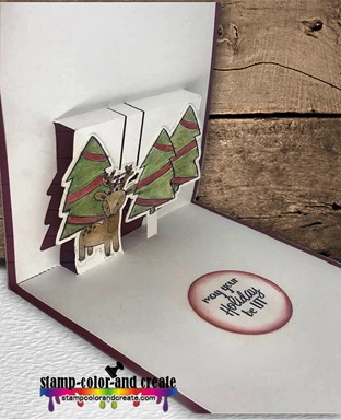
Here is another look at the inside just before I added the ornaments. You can really see how the image pops out.
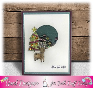
To see more of Beth’s great stamps, visit her shop here. She’s just released 8 new sets and they are super cute.
That’s it for me today. Thank you for stopping by and I hope you have a great day!
Monday, November 5, 2018
Get Creative Challenge #75
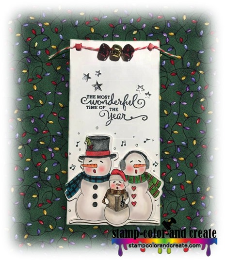
It’s time for another Get Creative Challenge. This month’s challenge is an “Anything But A Card” challenge. I decided I’d make a Christmas tag and I’m using this cute trio of Caroling Snowmen from Paper Nest Dolls. Aren’t they so adorable! I colored this image with Prismacolor Pencils and a blender pen. I popped it up to add some dimension to the tag. I’m still learning how to color with pencils. I’m enjoying the process, though.
Thanks for stopping by to take a look. Don’t forget to head on over to the Get Creative Challenge to enter this month’s challenge.
Sponsors this month are:
Sunday, October 21, 2018
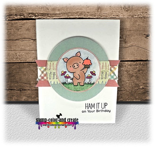
Ham It Up Birthday…
Hi Friends,
Just stopping by for a quick share before heading out to Church this morning. There is nothing very special about this card. The papers are from Pixel Scrapper. They are digital so I printed them on cardstock and cut the shapes out using my Silhouette Cameo. I used an image and sentiment from My Favorite Things “Hog Heaven” set and colored it with my PrismaColor Pencils. I purchased this set from Maple Syrup Designs – a new Canadian company that I highly recommend. The owner, Colleen Tyler, is amazing and very willing to answer any questions you might have. Shipping was super fast. I’ll definitely be buying from her again. If you are looking for a great online store go check her out, especially if you are Canadian. You won’t be sorry.
That’s all from me today. I hope you all enjoy your day. See you again soon.
Saturday, October 13, 2018
When Pigs Fly Happy Birthday
I love this image from Paper Nest Dolls. I used my new Prismacolor pencils to color it. I’m still learning how to use colored pencils but I’m happy with the outcome here. I kept the card clean and simple and used some free digital papers that I found on Pixel Scrapper.
Thanks for stopping by for a look. Enjoy the rest of your weekend!
Saturday, September 15, 2018
Coffee & Friends
I really enjoyed making the cupcake pop-up card so I decided to give it another go. This time my theme was friendship and I found the cutest image on google. Did you know that just because an image is on google that does not mean it’s free to use? It may not seem like a big deal to you, but, as a designer, I really struggle with the fact that many people think google is a free for all. It’s not. Luckily, there is a way to make sure you are using an image that you have permission to use by filtering google so that it only shows you images that are free to use. By doing this you don’t risk infringing on someone’s copyright. It’s quite easy.

Just type what you are looking for in the google search bar (make sure IMAGES is selected) and then you can select TOOLS and choose the usage rights you desire. Since I knew that I would not be selling this card, I choose “labeled for noncommercial reuse”. The image I am using today can be found HERE.
That’s all from me today. Have a great day!
Don’t forget there is still time to enter my giveaway!
Details can be found HERE.
Wednesday, September 5, 2018
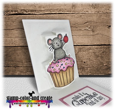
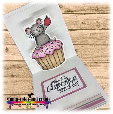
It’s A Cupcake Kind Of Day

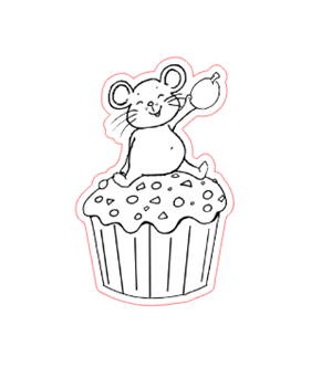
The first thing I needed to do was take a trace of my image so that I had something to convert into a pop-up shape. I offset it slightly so that there would be a white border around my finished pop-up. At this point I printed the image and cut it using my Cameo’s print and cut feature.
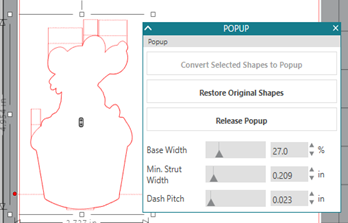

I moved the pop-up piece so that the dashed line on the bottom (with the 2 red dots on either side) was lined up with the centre fold and then aligned it so that it was directly centered. I pulled the smaller rectangle off the mat as it was no longer needed. I grouped the remaining two pieces on the mat together so that the pop-up would not shift off centre and then I used my Cameo to cut the piece out.
I colored the digi image with my Copics and adhered it to the card along with a sentiment to finish off the inside. I cut a piece of white cardstock to 4.25-inches wide by 11-inches long, folded it in half, and adhered this panel to the inside.
All I had left to do was to decorate the front of the card. I kept it fairly simple because I wanted the focus to be on the inside.
That’s it for me today. I’ll be back soon (maybe even tomorrow) to share another cute pop-up card that I made. What can I say, it’s a cool feature!
Don’t forget about my GIVEAWAY.
You still have time to enter!
Monday, September 3, 2018
Get Creative Challenge #73
The first layer of my card is cut from some blue paper that has a bit of a glitter effect to it. I added the white mat on top of that and then set about to make my cupcake. I selected a digital cupcake image designed by Limited Runs and then traced it with my Silhouette. I extracted the icing layer from the traced image to use for my cupcake. I cut the cupcake top (not including trees) from a piece of Silhouette Double-Sided Adhesive Paper. I removed the backing and sprinkled some glitter embossing powder over it to make a sparkly icing and then heat set it with my heat gun. I colored the trees and the cupcake paper with my copics and used some clear Wink Of Stella to add some dazzle to the ribbons and balls on the trees. I added some clear jewels and a sentiment to the card to finish it off. You may wonder why I chose a happy birthday sentiment to use on a card that has Christmas trees on it. Well, I know a few people who have birthdays on Christmas day so I figured this image would work very well to wish them a happy birthday with. We’d love to have you participate in this challenge so head on over to the Get Creative Challenge Blog to enter.
This month’s theme over on the Get Creative Challenge Blog is Lots of Bling & Sparkle. Sponsors are Limited Runs, Fabrika Fantasy, and Eureka Stamps.
Don’t forget about my GIVEAWAY.
You still have time to enter!
Thursday, August 23, 2018
Sympathy Set Back Card
Hi friends,
I am always looking for new inspiration for making sympathy cards. I found my inspiration for this card from none other than the great Jennifer McGuire. This type of card is called a set-back card. It’s made by using a stamp that comes with a die cut (but see my hack below using a Silhouette Cameo). I’ll place a link to her YouTube video demonstrating this technique at the end of this post.
 Since I didn’t have an appropriate stamp with a diecut, I decided to create my own with my Cameo and a digital image. First, I placed a floral image inside a rectangle that was 4-inches wide by 5.25-inches high. I turned my registration marks on to create a print and cut. This printed the image and cut a rectangle around it. I colored the flower, and set the panel aside for later.
 I then turned off my registration marks and being careful not to move the flower, I offset it by 0.080. Then I cut that piece out of colored cardstock using my Silhouette Cameo. I used my paper cutter to trim down the panel so that I was left with the middle portion of the panel which was split into 5 pieces; the left side, the right side, and 3 smaller pieces .
I adhered each piece on either side of my flower with some pop dots to set the flower back. The 3 tiny pieces I adhered directly to the cardstock with Tombow Mono liquid glue. I trimmed a little bit off the top and bottom of the panel and adhered it to my folded card base that I had matted with a 4.0-inch x 5.25-inch piece of colored cardstock. I added a sentiment to the card to finish it off. Jennifer added a strip of black cardstock along the top and bottom of the cutout panel but I forgot to do that. I think it would have looked better had I done so. This hack sounds like a lot of work but it really isn’t too bad at all.
Here is a link to the video so that you can see this technique in action. Jennifer shares several different ways you can use this technique. I really like it and will probably try it again sometime.
That’s all for today. Thank you for stopping by and see you again soon.
Friday, August 17, 2018
Another 6x6-inch One Sheet Wonder
Hi friends,
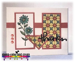
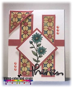
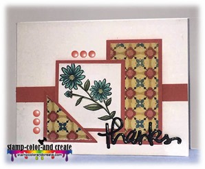
I am back to share some one sheet wonder cards that I made. This time I worked from a template created by a woman named Deb Valder, a Fun Stampers Journey Coach. This template makes six beautiful cards! A link to Deb’s video is at the bottom of this email, but, before you run off to view it (because I know you’re going to want to), please just take a minute to look at the cards I made and read about how I added a couple of extra touches to make them just a little different from the cards in her video.
Here is a peek at the cards…
I colored the flowers with copics and created the sentiment using my Cricut Explore. I cut the “thank you” out four times from a piece of black cardstock that was adhered to some Stick-It Adhesive. I layered them one on top of the other to build my sentiment up, and then coated it with clear embossing powder.

I did the same thing for all of the cards made from this template.
 |
 |
As promised, here is a link to Deb’s video explaining exactly how to create these beautiful cards!
Thanks for stopping by. I’ll be back again soon to share some more cards with you. And very soon, I will have a special little announcement to share with you as well.
Talk to you soon!
Tuesday, August 14, 2018
Time For Another Spoonie Card (and a tease)…
Hey there friends! I’m so excited to share my first “real” post (i.e not transferred over from the other blog, a not a welcome post) with you. As you may or may not know, I recently shared some insight on what it’s like to be a spoonie. You can read more about that here.
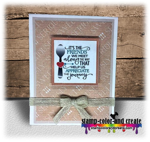
Today, I made another quick and very simple card to share with you all. The background paper says “seriously sweet” and I popped the image up on some rose colored cardstock with pop dots. I added the ribbon to finish it off. Simple, but cute…in my opinion.
I have a lot more cards to share in the coming days so I do hope to see you return. Before you go, I’d really love it if you would subscribe to my blog. I have something exciting planned for those who sign up by email. I’ll be sharing about it in a week or two and you won’t want to miss it! (it may involve some sort of goody bag)…
Talk to you soon!
Welcome!
Hello, friends! It’s wonderful to see you here. I’m so thrilled that I finally have this blog up and running. It’s been a long time coming. I do hope you like the new name and branding. It’s still a work in progress but so far I’m so pleased with it and I feel that I am to the point of being able to release it to the public. It’s taken me years to finally come up with a name and brand that I know I’m willing to stick with forever.
Moving forward, all posts that I make will be on this blog so please take a moment to use one of the methods I’ve provided to subscribe to this blog so that you will be notified when I post new things. It would mean so much to me.
You can follow me by choosing one of the following 3 options in the left-hand sidebar:
Google+ | |
Bloglovin’ |
If you have any family and friends who love to craft, please consider sharing my blog address with them as well. I’d love to have some new vistors to my blog.
I’d love it if you’d leave me a comment today to let me know you found your way here! Thanks so much.
I have made some cards that I’m excited to share with you and I will be putting those up in the next couple of days so please watch for them. In the meantime, pull up a chair, relax, and have a look around at the new surroundings.
Talk soon.
Wednesday, August 8, 2018
6x6-inch One Sheet Wonder Template
The other day I posted 3 A2 sized cards (4.25x5.5-inches) that I had made from one sheet of 6x6-inch designer cardstock and 1 sheet of 8.5x11-inch colored cardstock. These were made from a very simple template that I created and it makes a total of 4 cards. I love One Sheet Wonders because they make card making so simple. One of my followers asked me to share the template so I’m doing that today as well as an example of what the layouts should look like when you are done.
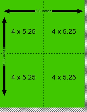
First I took one sheet of 6x6-inch paper and cut it into the following pieces:
The only thing you need to do once you’ve cut the 6x6-inch cardstock into the 3 pieces is cut the square in half diagonally.
You will need a piece of 8.5x11-inch colored cardstock for your layers that compliments the piece of 6x6-inch cardstock you chose. Cut this cardstock into 4 equal pieces as shown below:
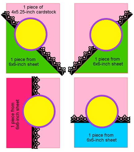
Now all you need to do is put your cards together. Easy peasy! I created some circular pieces for the sentiment and used a border punch to create my scalloped border. You can do whatever you like to dress yours up. Below is an example of the layouts. (Go HERE to see the actual cards). You can see in my example below that the light pink areas are the 4x5.25-inch layering pieces, and the green, dark pink, and blue areas are from the 6x6-inch piece of cardstock. Adhere the finished product onto an A2-size card base.
I hope this is helpful. I would love to see the cards you create using this template! I have a “Share With Me Please” feature that you can get to by clicking on the link across the top of this page.
Just follow the instructions on that page and then drop me a comment to let me know you shared.
Thanks so much and I hope you have a great day!
Tuesday, August 7, 2018
What’s The Spoon All About?
I was challenged to make a one-layer card in a new group that I joined on facebook (more on that later). I had an idea in my head of what I wanted to do but upon execution I wasn’t happy with the result.
My goal was to stamp an image and mask it off and then use my Zig Clean Color Real Brush Pens to make a background. Easy- peasy-pretty right?! Ummm, nope, nada, no siree, lol.
I picked out the colors I wanted and, after using an acrylic block to scribble the marker on, I added some water. I dipped the a paint brush into the watered-down ink and ran my fingers over the brush hairs to create flecks of colored drops across the cardstock. I did this with each color I chose. As you can see in the photo, it turned out terribly. When I masked off the image I used a post it note and applied it to the bottom corner on top of the image. This left me with a square edge around the image and I did not like that so I tried adding flecks of paint, first by just dabbing the pen straight to the paper – nope, not a good idea, lol – and then using the same technique as above with the paint brush. I didn’t like that the flecks covered up the image in some places and it just ended up being very messy.
So I came up with another idea. Instead of flicking the paint off the brush with my fingers, I dabbed the brush into my watered-down ink and then blotted it on a paper towel. Then I took the brush and dabbed the cardstock in random places. I did this for each color that I chose to use. As I layered on the ink, the colors became more vibrant. I think the 2nd idea resulted in a much better outcome. What do you think?
So, what’s with the spoon on the card you ask? “Spoonies” is a term used for people who battle chronic illness on a daily basis. The term “spoonie” originated from The Spoon Theory, a story written by Christine Miserandino. Essentially, the Spoon Theory illustrates the challenges that someone living with a chronic illness faces every day. As anyone living with a chronic illness can attest, taking medicine, crying in pain, or struggling through the simple tasks of life are hard enough but then factor in the reality that the illness, which happens to be “invisible,” is difficult for even good friends and family to truly understand. Chronic illnesses can range from fibromyalgia, lupus, chronic pain, depression or other mood disorders, and chronic fatigue, among others. Because a spoonie is relatively mentally and physically healthy in appearance, it’s very hard to explain what it feels like to live with a chronic illness.
One day, Christine was out for lunch with a friend when her friend asked her what it felt like to have lupus. She started to tell her all about the aches and pains and medications but her friend kept pursuing and wasn’t satisfied with those answers. Christine, realizing that words alone were not going to cut it, grabbed some spoons and began illustrating her life with lupus. She laid the handful of spoons out on the table and explained that the spoons symbolize all of a patient’s daily energy reserves. Every activity, no matter how thoughtless and automatic, depletes from the energy supply. Getting out of bed, showering, brushing your teeth, getting dressed, eating, and any number of ordinary tasks threaten to deplete energy at any given time. The longer the list of activities, the less spoons available to move on to the next task. Very quickly her friend realized that, with every spoon taken away, it makes it more difficult for a person with chronic illness to keep up with daily tasks and responsibilities.
I started this post by mentioning a group that I’ve recently found on facebook where people living with chronic illness, like myself, can gather for support. It’s a place where we share our crafty creations but also feel safe enough to share our struggles. The group was created by Rachel Winn who is a fabulous encourager. If you consider yourself a spoonie, we would love to have you join us in our “Stampers Without Spoons” facebook group.
Last, but not least, I want to give a shoutout to Beth Duff Designs. She’s a relatively new designer on the scene (to me, anyhow) and she’s wonderful. Her facebook group is how I found out about the spoonie group so thank you Beth! You can find her facebook group here and her shop here. Please go take a look. I’m certain you will like what you find.
Thanks for stopping by. I will be back again soon with more cards to share.
Sunday, August 5, 2018
6x6-One Sheet Wonder
Take a peek…
These cards are fairly simple so not a lot of explaining is needed. I do love the pink, grey, and gold foil combo.
The words hugs, happy, and love were cut using my silhouette. I adhered a piece of pink cardstock to a Stick-It Adhesive sheet and then cut each word four times and layered one on top of the other to build up the thickness so that it would pop off the page.
I stamped the words birthday, much, and & kisses with some London Fog memento ink. I used my Misti to easily stamp the words several times to make them a little darker. The grey scalloped border was made using a Martha Stewart Edge Punch.
That’s all from me today. I have several more cards to share coming shortly. Thanks for stopping by to have a look. Please leave me a comment to let me know you were here. It’s always appreciated.










![clip_image002[5] clip_image002[5]](https://blogger.googleusercontent.com/img/b/R29vZ2xl/AVvXsEhUvxos4ho_V-Jajlpfql1Mu7ecr3egiVaT-4-DsoYMsBGwm0G6ehUrc1mmUv09PKWb3qm0VPpOqmmliUPcngt1V61c4FLuW4szXMPW63cqxPrkQBgYalS-aiQOW84W78MFY_2L8fOT8X1c/?imgmax=800)
![clip_image003[5] clip_image003[5]](https://blogger.googleusercontent.com/img/b/R29vZ2xl/AVvXsEgkCVvPwdCNMfSfNsN5nDv6yeYT2rzOHT0H8arqhynwLXCC_IzPQ-o5DO5nCRWt0h_kVVzU9S6uD3BlH0mqgGqU835dQK3qNL4T1Uy_dE58Ad7yya_px6l5k6Pn9rnTvBlW-5wruX8wJ4za/?imgmax=800)
![clip_image004[5] clip_image004[5]](https://blogger.googleusercontent.com/img/b/R29vZ2xl/AVvXsEjXWCFZm0xPnPIRHgf-5VDphAAbEjgVZ63WoiVj7gnttXCZy0xty2SX9Qpky4-8G3jmhY-ElmBJbwHKtIbcRvqWAPso6sJcfyRkRc5u5JADaXLN9Hq1cSpbbi_iquVAXlY4BPCHc_cHDQwd/?imgmax=800)

