Welcome To
This is the first in a year long series of monthly blog hops focusing on techniques for card makers. Each month we'll feature a different technique or fold or product. We've assembled a team of card makers who range from new to advanced so you'll get a great variety of cards and ideas.
This month we will be focusing on emboss resist techniques and WOW have we got some cool cards for you today. We really love feedback so please leave a comment on each of the blogs in today's hop. Each comment on the 12 hops throughout the year will be entered into a prize drawing for a $25 Blitsy.com gift certificate at the end of the year. Now on with the projects.
I decided to try watercoloring as my first attempt at this technique. I wasn’t that happy with the result .. I think I need better watercolor paper. Let me know what watercolor paper you like to use in the comments below!
Here’s what I did. I inked up the smooth side of my watercolor paper with some Versamark Embossing Ink and embossed it with some clear embossing powder. After I heatset it, I began adding my colors; Tattered Rose, Seedless Preserves, & Broken China. I tapped each color onto a clear acrylic block, mixed in a little water using my aqua pen, and colored my page.
| 
|
| 
The embossed areas resisted the ink while the paper soaked it up. I stamped the heart image on some cardstock, cut it out, and coated it with some Glossy Accents. I popped it up with some dimensionals. 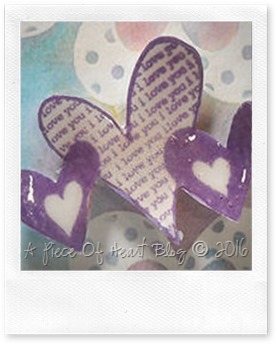
|
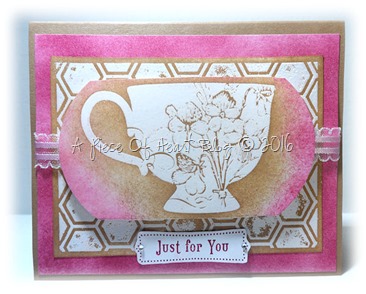
My second attempt came out a little bit better. I stamped some plain white cardstock with my embossing ink and heatset it. I stamped it with a hexagon background stamp and used my sponge dauber to ink the page with Close To My Heart’s Desert Sand Exclusive ink.
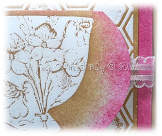
I stamped the teacup onto a separate piece of cardstock and inked it up as well with the same ink color. See how the ink has seeped through the cracks on the cup and the spaces of the background yet resisted the images. I sponged around the outside edges with some Tim Holtz Picked Raspberry ink.
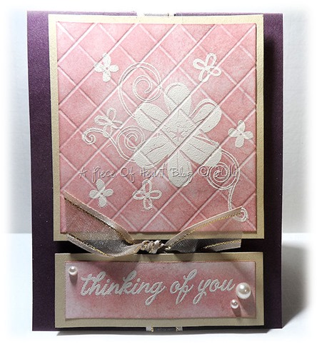
Last, but not least, is my favorite of the 3 cards.
I used my bone folder and scored diagonal lines on a 3.5-inch x 3.5-inch piece of cardstock. I laid the cardstock on my Scorepal board with the points facing towards the top and bottom of the board (like the shape of a diamond) and scored across it at every 1/2-inch. I turned it 90 degrees and scored diagonal lines again at every 1/2-inch to make this tiled pattern.

I inked up my stamp with some Versamark Embossing ink and stamped my image onto the paper – on the debossed side - being careful not to push too hard so that the ink didn’t creep down into the debossed lines so that I could achieve a somewhat distressed look to it. I covered it with an off-white embossing powder and heatset it. For the most part it turned out well but the embossing powder did melt down into the crevices in some areas. I used a regular piece of sponge to lay on some Tim Holtz Distressed Tattered Rose Ink. The ink resisted the stamped areas as well as the debossed areas. I added a couple of pearls, some ribbon, and a sentiment to finish it off. I’m really happy with how this one turned out! Third times a charm, I guess *smile*.
I should mention that after I finished inking and watercoloring over my embossed images, I wiped them down with a baby wipe to remove any remnants of ink that was covering the images.
Don't forget to comment on all the blogs in the hop each month to be entered into the drawing.
Here's today's line-up in case you get lost along the way:
Theresa
Kim
Claudia
Denise
Debbie
Sharon *YOU ARE HERE*
Lisa
Jearise




Sharon,
ReplyDeleteGreat job! All the cards are super cute, but that last one with the tile pattern is amazing!
Thanks for taking this journey with me.
These are wonderful cards! Your water coloring looks pretty darn good to me even though you said you weren't that happy with it! I use Strathmore paper.
ReplyDeleteThat last card is very cool! It's a two-fer with emboss resist techniques...first with the debossing and then with the embossing powder!
I enjoyed hopping with you!
Sharon you made some really impressive cards. Love the the hearts, really love the tea and the embossing on the last hits a home run! This will be a fun year :-) Regarding watercolor paper, Strathmore is a great choice, but it all depends what color medium you are using...
ReplyDeleteAll great cards! I like the hearts so softly blended in the background. The teacup is a pretty stamp. The background you made with the scoring tool looks awesome! I will have to try this as it has been quite a while. Thanks foe sharing your ideas.
ReplyDeleteGreat cards! The last one is my favorite! Thanks for the tip about removing ink with baby wipes!
ReplyDeleteLove that first card. I know you said you weren't happy with the results, but I think it turned out great. Love the colors. Love that tea cup card . . . one of my favorite stamps. The scored one is really cool. Reminds me of a tiled wall. Awesome.
ReplyDeletePretty cards. I think my favorite is the teacup!! Super cute
ReplyDeleteI like all the cards, especially the scored one.
ReplyDeleteYour Scored card is so unique but the teacup one is my fave
ReplyDeleteThey're all great! But I love that you totally hit it out of the park by creating your own debossed design. Fantastic. Great hopping along with you!
ReplyDeletewhat lovely cards! I like the teacup and I love the quilted look of the other!
ReplyDeleteAlicia
I like your technique! Beautiful cards! My favorite is the middle one!
ReplyDeleteYour cards are so pretty! I really like your fist card.
ReplyDeleteNice job, I like the tea cup, but I am partial to those types of designs. It is interesting that you scored the card before inking it.
ReplyDelete